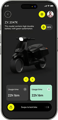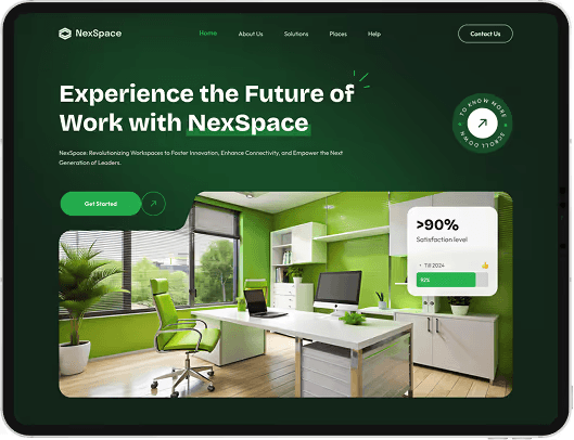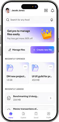
A step-by-step practical tutorial on nesting auto-layout frames, managing min/max bounds, wrap behaviors, and absolute positioning for responsive UI layouts.
Understand Frame Orientation & Direction (Shift + A)
Select any group or frame and press `Shift + A` to convert it into an Auto Layout frame. Choose between Horizontal (row) or Vertical (column) direction based on content flow.

Master Resizing Behavior: Fixed, Hug, and Fill Container
Understand the core resizing states: `Hug Content` adapts the frame size to fit child elements, while `Fill Container` stretches child components dynamically when parent dimensions change.
Set Min & Max Width/Height Constraints
Prevent layouts from shrinking too small on mobile or expanding excessively on ultra-wide screens by setting strict `Min W` and `Max W` boundary rules.

Utilize Auto-Wrap for Responsive Card Grids
Enable the `Wrap` setting in Auto Layout for element lists so cards wrap automatically onto new rows when container width narrows.
Leverage Absolute Positioning Within Auto Layout
Pin notification badges, close icons, or decorative elements precisely without disrupting the flex flow using Figma's `Absolute Position` toggle.
Want to take these skills further with hands-on projects and 1-on-1 mentorship?