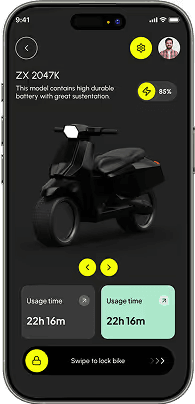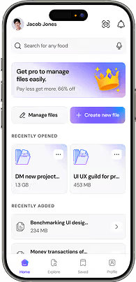

Essential mobile UX principles: thumb-zone ergonomics, bottom sheet navigation, gesture interactions, and iOS Human Interface vs Material 3.
The Steven Hoober Thumb Zone in Large Screen Devices
With modern smartphones exceeding 6.5 inches, top navigation bars and hamburger menus are out of comfortable thumb reach for 80% of users. Place core navigation tabs, search triggers, and primary CTA buttons in the bottom 40% of the screen.

Bottom Sheets Over Full Page Transitions
Modal bottom sheets preserve spatial context by allowing users to complete secondary tasks (filters, sorting, item previews) without navigating away from the primary feed.
Haptic Feedback & Gesture Discoverability
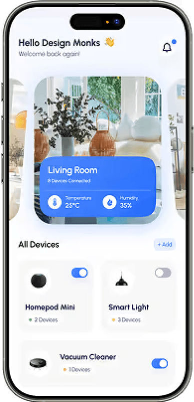
Pair swipe-to-dismiss, pull-to-refresh, and drag-and-drop gestures with subtle haptic vibration triggers to reinforce the feeling of physical manipulation on glass.
Next Article
Read Next Article