
The 60-30-10 Visual Proportion Formula
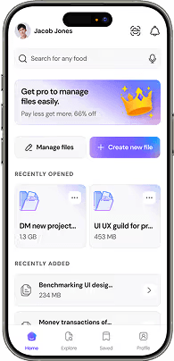
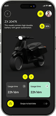
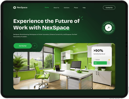
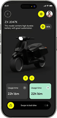
The 60-30-10 rule is the timeless interior design principle applied to modern branding and UI design: 60% dominant neutral surface (dark slate or crisp canvas), 30% structural secondary color (cards, borders, typography), and 10% intentional focal accent (CTA buttons, key notification badges).
Subconscious Emotional Triggers of Hue & Saturation
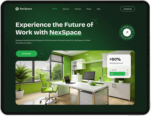
Blue signals security, intellect, and technical precision (ideal for SaaS and education). Emerald green communicates growth, stability, and trust. Deep amber radiates energy and momentum. Choose brand hues based on your customer's psychological needs, not arbitrary personal taste.
Digital RGB Gamuts vs. Physical CMYK Separation
When designing identity systems that span both digital web apps and physical packaging, always test high-saturation RGB hex values in CMYK color profiles to prevent unexpected dulling in print production.