
01. Respect Mental Models & Jakob's Law of Internet User Experience
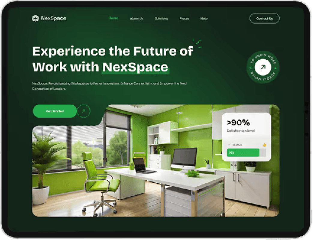
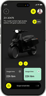
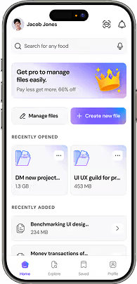
Jakob's Law states that users spend most of their time on other websites and applications. When they arrive at your product, they bring ingrained mental models regarding where navigation bars, search inputs, modal triggers, and checkout buttons should live. When you innovate on basic interaction mechanics without justification, you introduce cognitive friction. Design interfaces that feel immediately familiar, reserving your creative energy for solving core user problems with extreme speed and clarity.

02. The 8pt Spatial Grid System: Mathematical Cadence in Layouts
Professional digital interfaces are governed by mathematical predictability. Every margin, padding, row gap, and icon dimension should be a multiple of 8 (with 4px half-steps for micro elements like badges and button padding). Applying the 8pt grid eliminates guesswork between designers and frontend developers, ensures pixel-perfect rendering across high-DPI displays, and establishes visual harmony across multi-device viewports.

03. Nielsen's 10 Usability Heuristics in Modern Product Workflows
Visibility of system status, match between system and the real world, user control and freedom, error prevention, and recognition over recall remain the gold standard. Every button press must provide immediate state feedback (hover, active, loading spinners, success toast). Every destructive action must offer an undo mechanism. By building error prevention directly into input fields and dropdowns, you eliminate user anxiety.

04. WCAG 2.2 AAA Accessibility & Optical Color Ergonomics
Accessible design is simply great design. Maintain a minimum contrast ratio of 4.5:1 for normal body text and 3:1 for large display titles. Never use color as the sole indicator of system state — always pair red error states with clear alert icons and instructional microcopy. Test keyboard focus rings, screen reader DOM landmarks, and minimum 44x44px touch targets on mobile viewports.

05. Progressive Disclosure: Eliminating Cognitive Overload
Never overwhelm the user by displaying all available features simultaneously. Use progressive disclosure to present primary actions prominently while nesting advanced filters, settings, and complex operations within secondary expandable drawers, tabs, or contextual tooltips. This maintains a clean visual hierarchy and accelerates task completion rates.